
MEMPHIS, Tenn. — Robert Caen, marketing manager for Uniform Masters, had a problem as the company was reaching its 70th anniversary in 2016.
His company is a uniform vendor but its logo didn’t convey anything about the business to anyone who saw it. The solution? Create a new logo to rebrand the company.
American Laundry News spent some time with Caen, learning about the business and its rebranding effort.
Q: Tell us a little of the history of Uniform Masters.
Uniform Masters was founded in 1946 as Mechanics Laundry Service by Morris and Lenore Caen, my grandparents, after moving to Memphis from New Jersey with their two children, Richard, who is the current president, and Judy.
With few relationships in Memphis and little money, Moe started the business delivering laundry out of a 1940s Ford Woody station wagon. There was no rental service at this point in time. By the late 1940s, Moe had built the business to four routes. Rental had not yet been introduced, and the workweek consisted of six days. To minimize cash requirements, accounts were serviced twice per week, either Monday-Thursday, Tuesday-Friday or Wednesday-Saturday.
Our own production facilities began in the early 1950s. We were located across the street from what is now Bass Pro Shop, better known as the Memphis Pyramid in the heart of downtown Memphis. Over several years, we grew from one floor of one building to two floors of three buildings. In 1974, we moved to our current location across the street from the Memphis International Airport.
Q: What brought about the desire to update, rebrand, the business? When did the process start? When did the new logo go into service?
The catalyst for jumping into a large rebranding was rooted in our desire to better convey why a customer experience with Uniform Masters is truly different than with other companies and to overcome the phrase so commonly heard: “We didn’t know there was a local vendor.”
In short, finding effective ways to leverage a competitive advantage of being the oldest industrial launderer in the Mid-South against the perception that all uniform vendors are the same.
We are always hearing, “Uniform businesses all look and sound the same,” and we kept asking ourselves how can we break out of this appearance of being a commodity in the service industry. We knew inside our office walls we were different, and our customers know that we are different, but how can we better convey at first glance to a prospect that this company has charisma fueled by real people who have a passion for the services they provide, and that we aren’t an answering service with trucks that roam countless customers to make “deliveries”?
We provide a live person who answers phones. We have a service team that is proactive and has intimate knowledge of each of our clients. We take our work very seriously, but we are a family business—we wouldn’t be who we are if we couldn’t have a little fun and weirdness as well. It’s part of what makes our associates a unique bunch to the industry; there is a shared passion for doing the job right.
Q: Did you work with a design company? How did you decide how the new logo should look? What message are you trying convey with the new logo?
We worked with Trace Hallowell of Tactical Magic; his team is based here in Memphis. Trace has worked with 100-plus-year-old companies on rebrands in our local market, as well as with corporate giants like McDonald’s. We really found confidence in Tactical Magic’s encompassing strategic approach to looking at our audience as well as the history of what worked for the last 70 years to get us to today.
When approaching the design for the new logo, we really did a lot of research within our own organization and within our customer base in an effort to define our brand personality and values. Some words and phrases that guided us were “respectful,” “positive attitude,” “responsive,” “knowledgeable” and “having a sense of humor.” Also, “having pride in good results,” “credible but not corporate,” “blue collar chic” and “fashionably retro.”
Q: What did the old logo look like and how long had it been in use?
The old logo was designed in the late ’90s with an ambiguous marque that really didn’t convey any sort of message or feeling.
Our branding evolution has progressed as follows:
- Mechanics Laundry Service, “Work Clothes Specialist,” 1946–mid 1970s.
- Mechanics Uniform Service, “We Do the Dirty Work,” 1970s into the early 1990s.
- Master Service Systems, two divisions: Uniform Masters and Mat Masters, early 1990s to late 1990s.
- Uniform Masters, “Apparel and Floor Mat Solutions,” early 2000s to present day.
Q: What has been the response to the new logo?
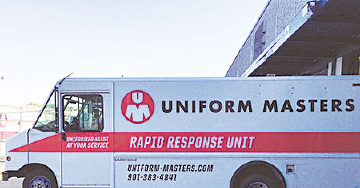
It typically gets a chuckle, and a “I see what you did there” response. People have had a big reaction to the new design of our truck livery, as it reads “Rapid Response Unit.”
Our goal is to be noticed and to create a memorable experience. I recently attended an evening meet-and-greet that one of our clients had for a big motorsports event and was asked about our rebranding, which turned into a handful of new leads solely off seeing our trucks’ new design around town.
Q: What does the future hold for Uniform Masters?
We are working diligently to improve all facets of our sales experience, from internal technology upgrades to seeing that the rebrand/marketing voice is reflected in all levels of our sales process, from how we build proposals to direct mail campaigns.
As we celebrate our 70th anniversary, we are looking forward to giving the same great service our customers have come to trust.
Have a question or comment? E-mail our editor Matt Poe at [email protected].